

|
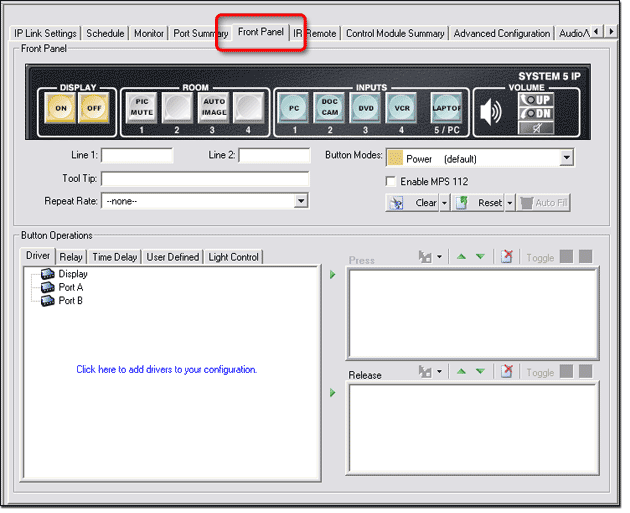
The Front Panel tab is a graphical representation of the control panel of a product. It gives you the ability to:
Functions of the Front
Panel tab vary depending on what product is selected in the IP
Link |
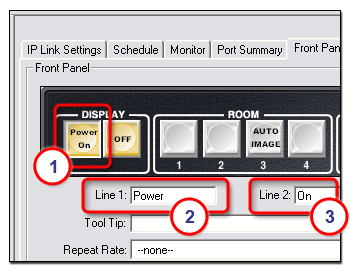
Setting a Button CaptionTo set a button caption:
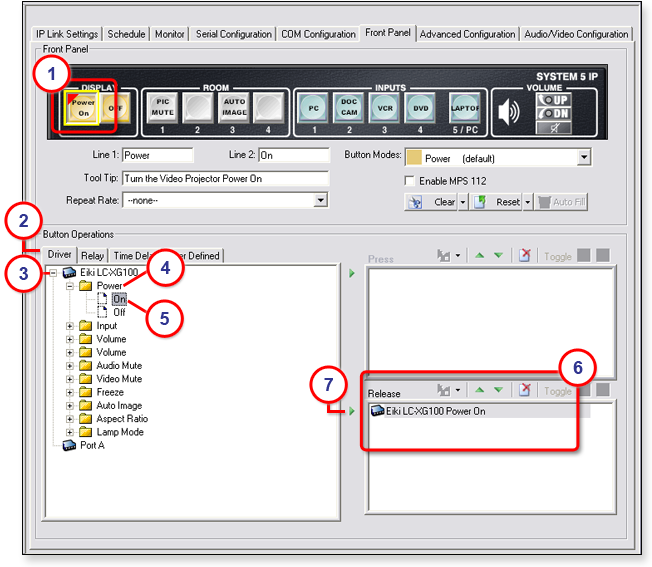
In the example on the right, Line 1: "Power," and Line 2: "On" are displayed in line 1 (top) and line 2 (bottom) of the selected button. A caption can be set for each button in the front panel display. |
|
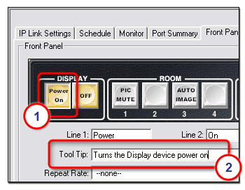
Setting a Button TooltipA tooltip is a descriptive line of text that is displayed in the GlobalViewer interface when the cursor is positioned over a button. To set a tooltip:
|
|
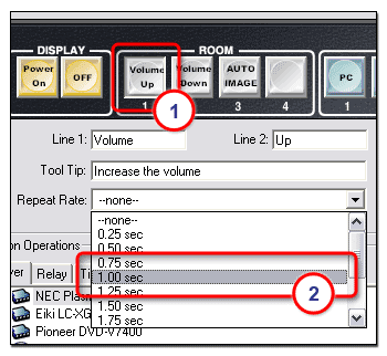
Setting a Button Repeat RateThe repeat rate is the rate at which a button repeats its function if the button is held down. ExampleIf you have configured a button as an increment volume button and given it a repeat rate of 1.00 second, as long as you keep this button pressed (the front panel button or the GlobalViewer button), the Increment Volume command is sent every 1.00 second. To set a repeat rate:
|
|
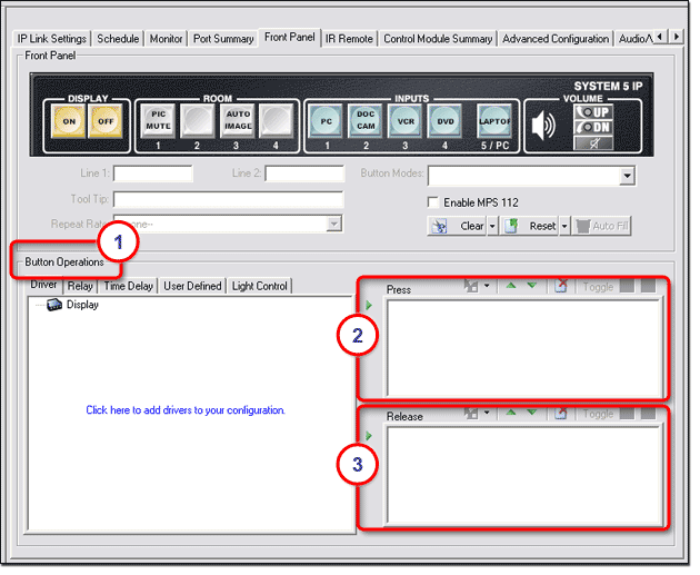
Setting Button OperationsThe tabs located within the Button Operations section include: The functions of each tab are described in the paragraphs below. Notes:
Functions
in the Button Operations (1)
section are selected and moved
to the Press (2)
section or Release (3) section
to be assigned to a button. If a function is moved
to the Press
section, the function occurs
when the selected button is pressed (either on the physical front control panel
of the device or in the GlobalViewer interface). If
a function is moved to the Release
section, the function occurs
as the button is released. See the Build Changed Configurations section for more information. |
DriverTo assign a driver function to a device button:
- or - Click one of the Right Arrows (7) to move the selected function to the respective Press section or Release section. - or - Click and drag the selected function and drop it over the selected button (1). |
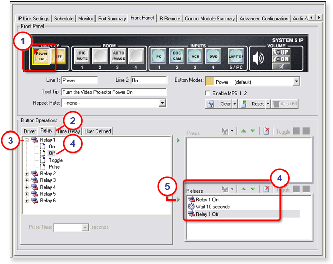
RelayThe Relay tab in the Button Operations section gives you the ability to add relay functions to a selected button. ExampleIf you want to power on a projector and lower a projector screen all with one press or release of the Display Power On button, you can:
To add a button function using the Relay tab:
- or - Select the desired relay function and click one of the two Right Arrows (5) to move the selected relay function to the respective Press or Release section. The example below shows the result of adding a Relay
On function and a Relay Off function separated by a |
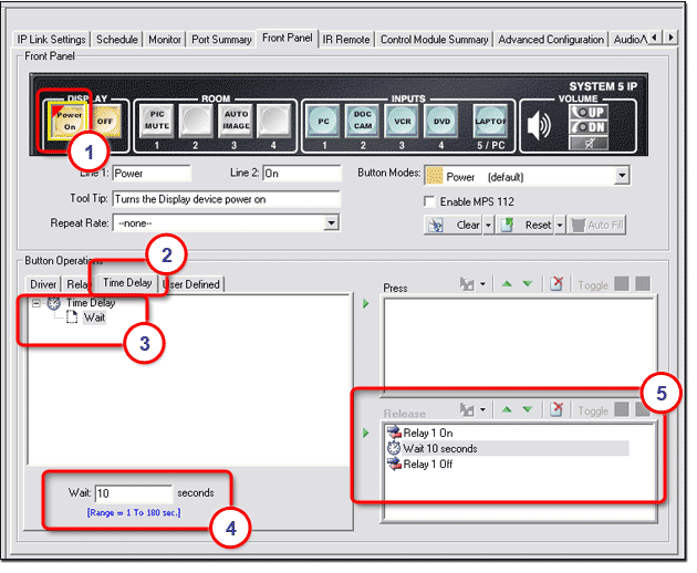
Time DelayWhen you add multiple functions
to a front panel button, you may want to insert a time delay between the
functions. The Time
Delay tab provides the
capability to add a delay period ranging from 1 second to To add a time delay:
- or - Select the Wait function and click one of the two Right Arrows to move the selected function to the respective Press or Release section. Note: In the example below, a 10-second delay has been placed between Relay On and Relay Off functions, which allows the relay to be on for 10 seconds before turning off. |
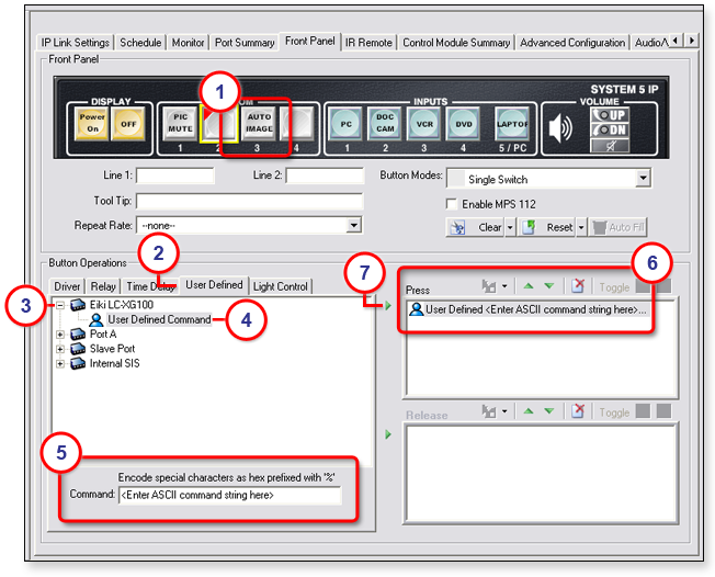
User DefinedThe User
Defined tab in the Button Operations section allows you to add
button functionality that is not For a list of ASCII codes, open the View menu and select View ASCII Chart. To add a user-defined command:
- or - Click one of the two Right Arrows (7) to move the user-defined command to the respective Press or Release section. |
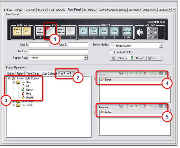
Light ControlThe Light Control tab allows you to assign an indicator color to both the Press and Release actions of selected buttons. Indicator Color options are:
Indicator Blink options are:
To assign an indicator color to a button:
Note: In the example below, a solid green indicator is assigned to the button when pressed. A solid amber indicator is assigned to the button when released. These indicators appear on the actual device button and in the GlobalViewer graphical representation of the button. |
Setting Button ModesThe options listed in the Button Modes drop-down list allow you to apply four different modes of operation for the Room buttons on the System 5 IP front panel. Button modes of operation are: Button modes of operation are described below. |
Single SwitchIn Single Switch mode, the push-button switch will perform the same primary function each time it is pressed. Single Switch mode is the factory default state of the Room buttons and is indicated by a gray-colored button within GC. Single Switch mode is the opposite of Toggle mode, which is described below. |
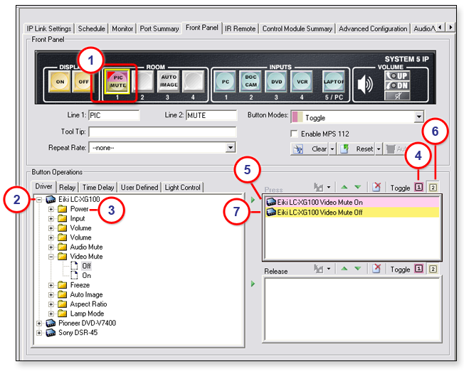
ToggleIn Toggle mode you can assign two different actions to subsequent depressions of the same pushbutton switch. If we apply the Toggle mode to a pushbutton switch, the initial press of the switch causes one action, and the next press of the switch causes a second action to occur. To create a Toggle mode button:
Toggle mode is indicated by red (top) and gold (bottom) colors on the switch as shown in the image below. |
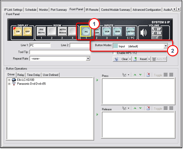
InputAn Input button mode means that when this button is activated, the audio or video input signal associated with this button is sent to the display device. To assign an Input mode to a switch:
|
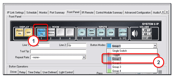
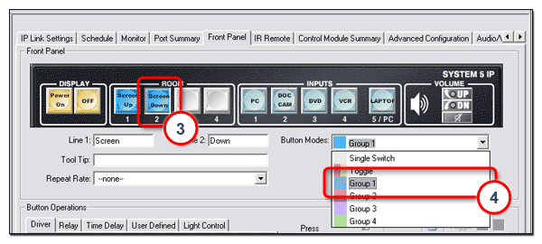
Group (X)When multiple buttons are assigned to a group:
To create a button group:
|
|
|
|
|
|
|
To return a grouped button to its original single switch state:
|
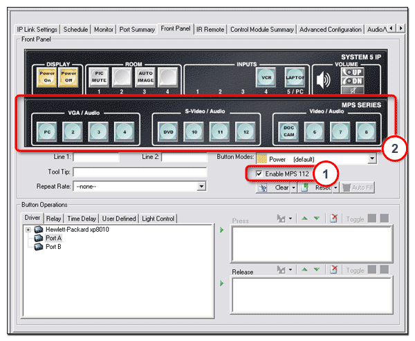
Enable MPS 112The Enable MPS 112 check box enables you to add the MPS 112 Media Presentation Switcher control panel to a System 5 IP control panel and configure all of the MPS 112 buttons along with the System 5 IP buttons. The Extron MPS 112 Media Presentation Switcher merges four independent switchers in a single enclosure:
To enable an MPS 112:
|
|
|
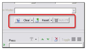
Clearing, Resetting, and Auto-filling Button CaptionsThe Clear button is used to clear all of the front panel button caption text. The Reset button is used to set all of the front panel button captions to their factory default text. The Auto Fill button is not active on the Front Panel tab. It is active on the Address tab when a Control Module is selected in the IP Link Tree window. See the Clearing, Resetting, and Auto-filling Button Labels subsection of "Control Module Summary Tab" for more information. |
|